
5 Signs Your Nonprofit Website Needs a Refresh
Summary
If your website feels like a ghost town, it probably is.
Ready to transform your nonprofit's online presence? Get my Nonprofit Website Builder course at marketyourmission.co/website and learn how to create a website that actually drives results for your mission.
In this video, I'll show you:
The two critical aspects of user engagement that determine if your website is working
Why mobile optimization isn't optional anymore (and the costly mistake most nonprofits make with PDFs)
How to identify if your website confuses visitors before they give up and leave
The inspiration factor that separates successful nonprofit websites from the rest
Whether your website is actually converting visitors into donors, volunteers, and clients
"This is the most important indicator that it's time for a new website. Your website should be attracting new visitors every single day."
If you want to build a website that consistently attracts and converts supporters to your mission, you need to understand these five critical warning signs that your current site is holding you back.
"I firmly believe that your website is the most important property you have on the internet, not your social media channels. It's your website because you own it and you can control the message that's on it."
In this episode, learn how to evaluate your nonprofit website's performance using these five key indicators. Plus, you'll discover the specific actions you can take to transform your website from a digital ghost town into a dynamic hub that drives real results.
Watch the video to get the full training.
Transform Your Nonprofit's Digital Presence
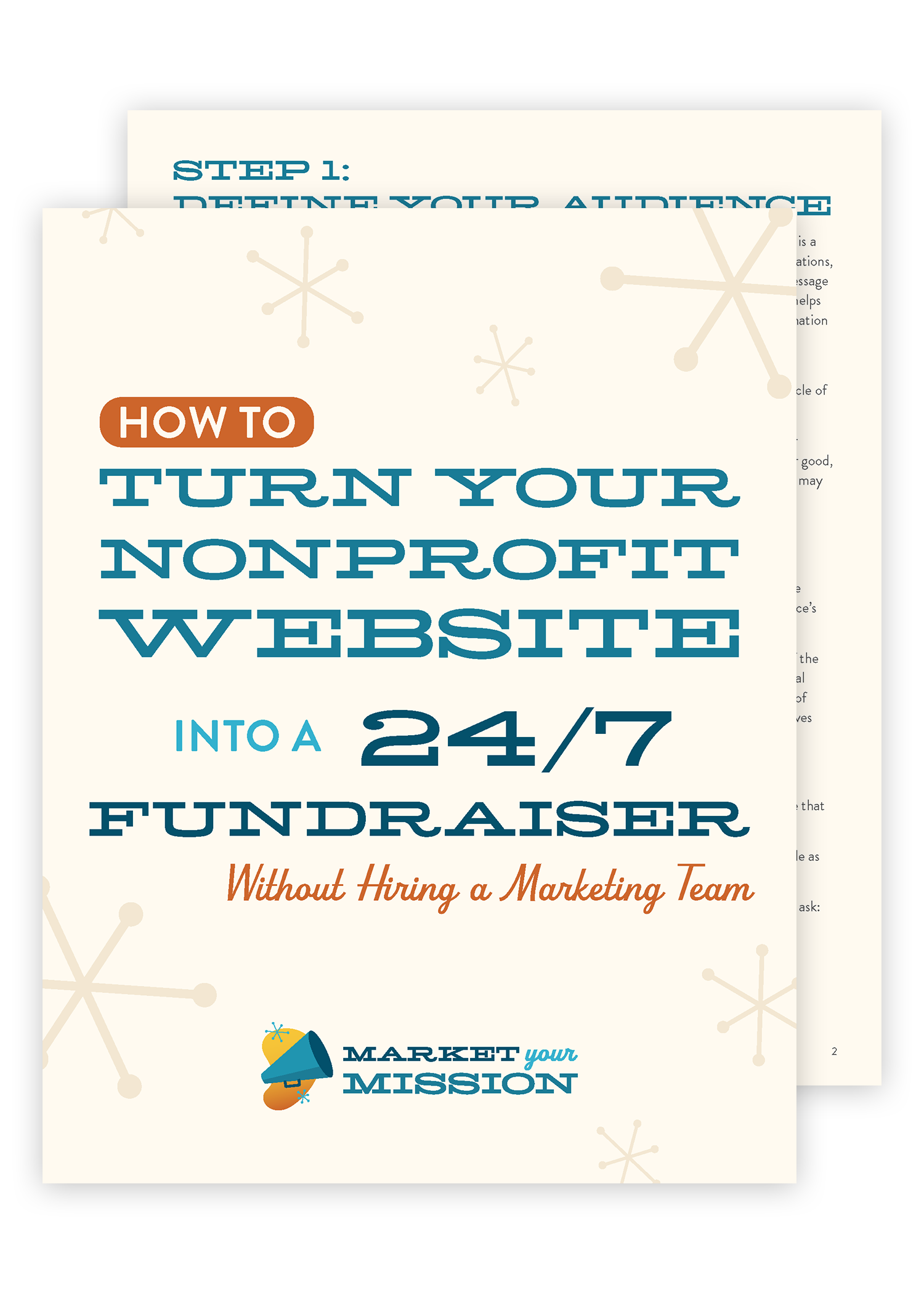
Ready to turn your website into a powerful mission-driving machine? Download my FREE Guide, “How to Turn Your Nonprofit Website into a 24/7 Fundraiser” and discover exactly what your site needs to attract more donors, volunteers, and supporters.
Frequently Asked Questions
What exactly counts as "poor user engagement" on my nonprofit website?
Poor user engagement shows up in two key ways: your website isn't attracting new visitors regularly, and when people do visit, they're not clicking through to explore other pages. If you're seeing high bounce rates where visitors land on one page and immediately leave, or if your site traffic has stagnated, these are clear indicators that your engagement strategy needs work.
How can I tell if my website is truly mobile-friendly?
Beyond just looking good on a phone, mobile-friendliness means your content is easily readable and navigable without constant pinching and zooming. A major red flag is posting PDF documents (like annual reports) that are sized for 8.5x11 paper - these are nearly impossible to read comfortably on mobile devices. Instead, extract that content and create mobile-friendly web pages.
What are the most common ways nonprofit websites confuse visitors?
Website confusion often stems from poor organization, unclear navigation, and hard-to-find information. If you're receiving phone calls or emails from supporters asking "Where do I find..." or "How do I...", that's a clear sign your site structure needs improvement. The solution is reorganizing your content with clear, intuitive pathways to the information people need most.
How do I know if my website inspires action?
An inspiring nonprofit website motivates visitors to take concrete steps - whether that's donating, volunteering, or engaging with your cause. If people aren't saying "Wow, I want to get involved" after visiting your site, or if you're not seeing conversions from website traffic, your messaging and calls-to-action need strengthening.
What results should I realistically expect from my nonprofit website?
Your website should consistently generate at least one of three things: donations, volunteers, or new clients/program participants. Every nonprofit, regardless of funding model, needs one of these elements to fulfill their mission. If your website isn't actively contributing to these goals, it's time for a strategic refresh.
How often should nonprofits refresh their websites?
While there's no universal timeline, monitor your site's performance continuously. If you're experiencing any of the five warning signs - poor engagement, mobile issues, visitor confusion, lack of inspiration, or poor results - don't wait. These issues compound over time and can significantly impact your mission's reach and effectiveness.
What's the difference between normal bounce rate and problematic engagement?
Some bouncing is normal - people click through from various sources and might not find what they're looking for immediately. However, if the majority of your visitors consistently leave without exploring any other pages or taking action, that indicates a deeper problem with your content strategy or user experience design.
Should I completely avoid PDFs on my nonprofit website?
PDFs aren't inherently bad, but they shouldn't be your primary way of sharing important information. If you have valuable content in PDF format (like annual reports), also create web-friendly versions of that content. This gives visitors options - they can read the information easily on any device or download the formal PDF version if preferred.
What makes Google and other search engines penalize websites?
Search engines now prioritize mobile-friendly websites in their rankings. If your site doesn't display properly on mobile devices, you're not just frustrating visitors - you're also being ranked lower in search results, making it harder for people to discover your organization in the first place.
How do I measure whether my website refresh was successful?
Track metrics that align with your mission goals: increased organic traffic, improved time spent on site, higher conversion rates for donations or volunteer signups, and fewer confusion-related inquiries. Most importantly, monitor whether your website is consistently attracting and converting the supporters your mission needs to thrive.
The Complete Guide: 5 Signs Your Nonprofit Website Needs a Refresh
When Your Digital Front Door Becomes a Ghost Town
If your website feels like a ghost town, it probably is. Here are five signs it's time to refresh your nonprofit website.
Sign #1: Poor User Engagement is Killing Your Mission Impact
Poor user engagement reveals itself in two critical categories that every nonprofit leader needs to understand.
Your Website Isn't Attracting New Visitors
Your website isn't attracting any new visitors, or not as many new visitors as you need. This is the most important indicator that it's time for a new website. Your website should be attracting new visitors every single day, and I teach you how to do that in my upcoming website course.
But suffice to say, if you're not attracting new visitors with your website, something to look at. Usually the number one cause of that is you're not creating unique or original content on a regular basis.
Visitors Aren't Clicking Through Your Content
The other aspect of user engagement - folks aren't clicking through. They land on a page and then they're gone in seconds. Well, that's going to happen. Don't worry about that. I think a bounce rate, that's what that's called is when a user visits your website and then they leave immediately.
That's called a bounce without. They haven't clicked on anything. They don't click through to view another page. Bounce rates are going to happen because folks are clicking through on your site or clicking through on your site. But if the bulk of your users are not clicking through to a different page, that's a really good indicator that you're not doing a good enough job of communicating or selling the value of your mission.
Sign #2: Mobile Optimization Failures Are Costing You Supporters
It's not optimized for mobile. Now, when I started my web design career back in 2005, and we were using table layouts and just piecing together websites as best we could, we had no idea that smartphones would completely change how people behave on the web.
The Mobile-First Reality of Today's Web
Well, today, most folks who visit your website are doing it with a smartphone in their pocket, or they're doing it on their smartphone. So it is incredibly important to make sure that your website is mobile friendly. And in fact, just a few years ago, Google and Bing started penalizing websites for not being mobile friendly.
The PDF Problem That's Destroying User Experience
Now, most modern website builders will take care of this more or less for you. But some things to look out for. A lot of folks I've seen upload PDF documents to the web instead of putting content on their website. They'll say, oh, take a look at our annual report and you click the link and it opens up a PDF document that's sized eight and a half by 11.
Have you ever tried to read an eight and a half by 11 sheet of paper on an itty bitty, like, three inch by five inch phone screen? You have to do that silly pinch and zoom thing constantly. It's just a pain in the rear.
The Smart Solution for Document Sharing
Instead of doing that, yes, you can still post your annual report PDF in all of its glory on your website, but take the text content out of that annual report and build a web page that includes all that information that is mobile friendly. So then, no matter how your website visitors want to read your annual report, they can do so easily and comfortably without that silly pinch and zoom. Pinch and zoom thing you have to do on on a PDF. That's a letter sized piece of paper.
Sign #3: Website Confusion is Driving Away Your Best Supporters
Is it confusing your visitors? Some of my clients have literally gotten phone calls or emails from their circle of support, from their donors, from volunteers, from community partners saying, I can't find this or I'm confused. Where is this? How do I do x, y, z?
When Confusion Becomes a Conversion Killer
If your website is confusing your visitors, if you're getting calls like that, or emails or comments on your blog posts telling you that folks are having trouble finding things. That is a great opportunity to take stock, reorganize your website, and give it a complete refresh.
Sign #4: Your Website Doesn't Inspire Action
It doesn't inspire. Yeah, that's right. If your website isn't inspiring anybody. Namely donors, volunteers and potential clients to take action. Well, it's probably time for a refresh.
Beyond the Basics: Inspiring Your Entire Community
Of course, your website should also inspire your board members, your staff, and the remainder of your community. I firmly believe that your website is the most important property you have on the internet, not your social media channels. It's your website because you own it and you can control the message that's on it.
The Inspiration Test for Mission-Driven Organizations
So if your website isn't inspiring, if you don't have people saying, wow, I want to take action, I want to give to your cause, I want to donate my time, volunteer. I want to call my representative or do some community organizing if it's not inspiring. Well, time to take a good hard look at what's going on under the hood and make some changes.
Sign #5: Poor Results Mean It's Time for Strategic Changes
Poor results. If you aren't getting the donations, the volunteers, or the clients you want from your website, well, that's a good reason to relaunch it.
Your Website as a Dynamic Mission Hub
Your website should be a dynamic hub that is consistently attracting and converting new donors, volunteers, and clients to your mission. Every nonprofit organization, no matter how you're funded. You need one of these three things in order to fulfill your mission. You either need more donations, you either need more clients, or you need more volunteers.
The Universal Truth About Nonprofit Success
Every one, every nonprofit organization needs at least one of those three things. And your website is the place to inspire, delight and even attract them. I'll teach you more on how to do that in my upcoming website course, which you can learn about at marketyourmission.co/website.
Quick Review: The Five Critical Warning Signs
Let's review real quick. The five signs it's time to refresh your nonprofit website.
Number one, it's not attracting new visitors, and those folks aren't clicking through to the other pages of your website.
Number two, it's not mobile friendly. In today's day and age, you cannot afford to have a clunky website that doesn't look good on mobile. And be sure not to post publications on your website as PDFs, unless you also put that content as text on the page, because it's a real pain to read a PDF on a phone.
Number three, it confuses visitors. If it's hard for folks to find information, they're just going to quit. They're going to leave your website and you lost them. You want to make sure that your site's pages are clearly organized, well-written, and contain the information that folks are looking for.
Number four sign it's time to refresh your website. It doesn't inspire not only doesn't inspire donors, volunteers, or clients, but it doesn't inspire your board, your staff, or your community to be involved in your mission.
And finally, you aren't getting the donations, the volunteers, or the clients you want from your website. No matter what type of funding model you have, no matter what your mission is, I guarantee you need at least one of these three things donations, clients, or volunteers.
Your Next Steps to Website Success
So if your website isn't getting you the results that you want, it's time to figure out how to make a change and make that website better. Come join me at marketyourmission.co/website.
Until then, go out every day and serve with heart, integrity, nerve, and excellence.