
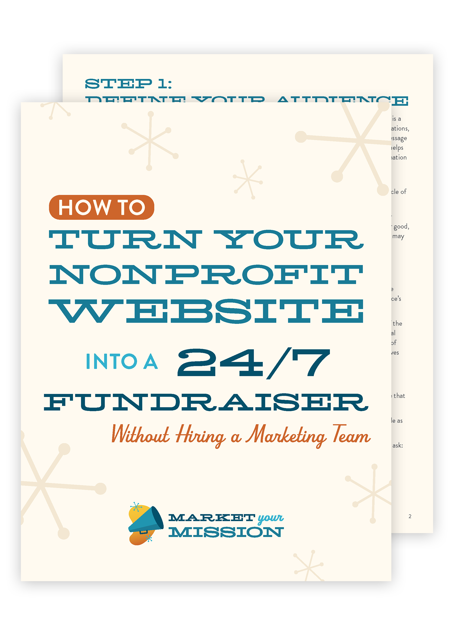
Nonprofit Website Design: Do’s and Don’ts
Summary
Today's modern website technology makes it easier than ever to create a beautiful, functional, nonprofit website. But it also opens up a whole can of worms of things you could do that'll make your website awful.
In this video, I'll show you:
How to design accessible websites that welcome ALL supporters (including the $200+ billion in annual spending power from people with disabilities)
Why flashy animations actually hurt your mission impact
The smart alternative to expensive developers that saves thousands
How compelling copy outperforms pretty design every time
Essential mobile optimization strategies that boost your search rankings
💡 "You can have the most simple, clean, bland website and raise tens, if not hundreds of thousands of dollars with the right message."
If you want to create a website that actually converts visitors into supporters, you need to focus on accessibility, purposeful content, and mobile-first design instead of flashy features that frustrate users.
🔥 "In the US, the annual discretionary spending of people with disabilities is over $200 billion, so you cannot afford to design an inaccessible website because you are missing out on a huge portion of the population who could be motivated to support your cause."
In this episode, learn how to avoid the five biggest nonprofit website mistakes while implementing proven strategies that actually drive donations and engagement. Plus, you'll discover why most nonprofits waste money on expensive developers when simple website builders deliver better results.
Watch the video to get the full training.
Free Guide
Frequently Asked Questions
What is website accessibility and why does it matter for nonprofits?
Website accessibility means designing your site so people with disabilities can navigate, understand, and interact with your content effectively. This includes considerations for visual impairments, hearing difficulties, mobility challenges, and cognitive differences. For nonprofits, accessibility isn't just about compliance—it's about inclusion and reaching the full scope of potential supporters, including people with disabilities who represent over $200 billion in annual discretionary spending power.
How do I check if my website has good color contrast?
The easiest way to check color contrast is using the free WebAIM Color Contrast Checker. Simply Google "WebAIM color contrast" and you'll find their tool where you can input your text color and background color to see if they meet accessibility standards. Pay attention to contrast not just on regular text, but also on text that appears over images and in graphical elements like infographics.
Should I use autoplay videos on my nonprofit website?
No, avoid autoplay videos. They frustrate users who come to your site expecting to control their browsing experience, and they can be particularly problematic for people using assistive technologies or those with sensory sensitivities. Instead, use engaging multimedia strategically—every video, image, or interactive element should serve a specific purpose in telling your story and encouraging action.
Do I really need to hire an expensive web developer for my nonprofit website?
Unless you have a multi-million dollar annual budget, most nonprofits don't need expensive developers. Modern website builders offer powerful, user-friendly tools that let you create and maintain your site in-house. This approach saves money and gives you more control over updates and content. Remember, developers are technical experts, not marketing or fundraising specialists—your time and budget are better spent on crafting compelling messages and strategies.
What's more important - website design or website copy?
Copy (your website's written content and messaging) is far more important than visual design. You can raise tens or hundreds of thousands of dollars with a simple, clean website that has the right message. Focus most of your time and energy on crafting compelling copy that clearly communicates your mission's value and inspires action. A beautiful website with poor messaging won't convert visitors into supporters.
How do I check my website's page loading speed?
You can check your page loading speed through Google Search Console, Bing Webmaster Tools, or by simply Googling "how do I check my page loading speed?" Search engines actually penalize websites that load too slowly, so this directly impacts your ability to reach new supporters through organic search results.
Why is mobile optimization so important for nonprofit websites?
Most website visitors now browse on smartphones, and this trend continues to grow. When you optimize for mobile, you automatically improve several other aspects of your site: faster loading speeds, properly sized images, streamlined content, and elimination of unnecessary elements. Mobile-first design creates a "lean, mean website machine" that serves all your users better.
What is proper heading structure and why does it matter?
Proper heading structure means using H1, H2, H3, and H4 tags in numerical order to create a logical outline of your content. Every page should have one H1 tag that tells users what the page is about, followed by H2 tags for major sections, H3 tags for subsections, and H4 for smaller elements. This structure helps screen readers and other assistive technologies present your content in a logical order for users with disabilities.
How much discretionary spending power do people with disabilities have?
In the United States, people with disabilities have over $200 billion in annual discretionary spending power. This represents a massive potential supporter base that many nonprofits overlook when they create inaccessible websites. By designing inclusively, you open your organization to this significant population who could support your cause with both their financial resources and their time and attention.
What should I focus on when creating multimedia content for my website?
Every piece of multimedia—videos, podcasts, images, graphics—should contribute to your mission and the message you're communicating to the world. Ask yourself: "Is this helping tell our story and inspiring people to take action?" Content shouldn't be flashy for the sake of being flashy or modern for the sake of appearing current. It should be purposeful and support your ultimate goal of encouraging people to get involved, join your email list, volunteer, or access your services.
Complete Video Training: Transform Your Nonprofit Website Strategy
The Modern Website Technology Paradox
Hey everyone, I'm Ricardo Ibarra with Market Your Mission. Today's modern website technology makes it easier than ever to create a beautiful, functional, nonprofit website. But it also opens up a whole can of worms of things you could do that'll make your website awful.
Today I'm talking about the do's and don'ts of nonprofit website design. We're going to talk about all the things that you should be doing, but most importantly, all the things that you should not be doing, not only for your users and your donors, but also to make your life easier.
Website Accessibility: Your $200 Billion Opportunity
The Critical Mistake: Creating Inaccessible Websites
Number one, do not create an inaccessible website. And what I mean by this is don't create a website without considering accessibility. One of the biggest things you can do to improve your website accessibility is to check color contrast. And that means the color of your text against the background color that it appears on.
Now it's super trendy to have light colored fonts and words on your website on a light colored background, and that is low contrast. It's really hard for folks with visual impairment, folks who wear glasses like me, or even folks who are colorblind, to read your content on your website. If you use low color contrast, it's also really challenging for blind or visually impaired users to navigate your website if the color contrast is too low.
Pro Tip: Free Accessibility Testing Tool
Here's a free tip: just Google WebAIM—web A-I-M, that stands for Web Accessibility in Mind. Google "web aim color contrast" and you will get an excellent tool put together to check the contrast of various portions of your website. And of course, you should pay attention to color contrast not only on the text on your website, but whether that text appears all over images, whether the information is presented on your website in graphical format. Say if you have an infographic on your website as an image, you need to check the color contrast.
Essential Accessibility Strategies
There are a couple of other things to think about when it comes to web accessibility. And don't worry, I'll be doing a whole bunch of videos on this in the future. Another easy way to improve the accessibility of your website is to make sure that the navigation of your site is clear and simple, and doesn't go more than two pages deep. So that means in order to find a piece of content on your website, the user should click no more than two times to get to that desired page.
Master Proper Heading Structure
And then the other thing you can do to improve accessibility on your website is to use headings correctly. You know in your website builder you've got that option for headings. Well, most folks use that just to style text. They think, "oh, this heading three is really pretty because it's all caps and it's got this cool loopy scripting thing." That's a technical term, by the way.
Well, that's not the correct way to use headings. What we need to do on every web page is make sure that your headings are in numerical order. You remember back in college or high school when you had to structure an essay and you had to write an outline. Well, your headings or the heading tags are what creates the outline of the content on your web page.
Now, when screen readers and other assistive device users use their tools to view your web page, they're presented with an outline based on the headings that you've put on that page. If the headings are all jumbled up, if you jump from—if you start with heading two and you jump to heading four and then back up to heading three, and then you use a heading one, and then it's all over the place—there's no logical reading order, which is the terminology, and it's really confusing for users because they're presented with that outline and it doesn't make sense because you're skipping all over the place.
Best Practice Heading Structure
Here's the best practice. You do want to use high contrast colors and test for accessibility. So design for accessibility. We're talking about this with color contrast. We're talking about simple navigation. And we're also talking about logical reading order.
When you use headings on a web page, every web page should have one H1 tag. That's it. And it should be at the top of the page. It should tell the user what the page is all about. Then you can use heading two, three and four tags to chunk your content into sections. So I like to think of heading two as a section header. You can have multiple heading twos on a page, but you need to make sure that they are defining big sections of content as you move down the page, not just because the heading two looks pretty, or it's bigger than heading three.
Underneath heading two, of course, comes heading three. I like to think of this as a paragraph header or a paragraph title, and then heading four for little smaller bits. But if you move to a next section, you got to jump back up to heading two. And then you can use heading three for your paragraphs, heading four for other smaller pieces of content.
The Financial Impact of Accessibility
Fun fact for you: in the US, the annual discretionary spending of people with disabilities is over $200 billion, so you cannot afford to design an inaccessible website because you are missing out on a huge portion of the population who could be motivated to support your cause, not only with their discretionary spending, but also with their time and attention.
Skip the Flashy Features: Purpose-Driven Multimedia Strategy
Avoid Unnecessary Animations and Autoplay
Don't think flashy animations and autoplay video will make your website look more modern. Oh my goodness, this drives me nuts when I go to a website and all of a sudden there's a video playing. It's even worse when there's noise to it.
Have you ever had that happen where you go to a website and you think you're going to do one thing and you spend 30 seconds just trying to close all the pop ups and the videos and try and figure out how to clean up the screen?
Well, a lot of modern websites have unnecessary flashy animations or autoplay videos because they think because they're using the latest technology that it's helping them look more up to date or cool or modern.
The Right Approach: Engaging Multimedia with Purpose
What I do want you to do is use engaging multimedia. Everything on your website should have a purpose, and that primary purpose is convincing people or encouraging or inspiring people to get involved with your cause. To join your email list. To sign up for your newsletter. To show up and volunteer. To submit a form to get services.
Engaging multimedia means that you are carefully thinking about every piece of content, every video, every podcast, every blog, every picture on your website that it's contributing to your mission and that message that you're carrying out into the world. It's not there to be flashy. It's not there to look cool or modern. It's there because it's helping tell your story.
Budget-Smart Website Development: Choose Builders Over Developers
Skip the Expensive Developer Route
Don't spend thousands of dollars hiring an expensive website developer unless you have a multi-million dollar annual budget. Most non-profits do not need to pay for an expensive developer.
The Smart Alternative: Website Builders
What you do need to do is you need to choose a website builder so that your website is easy to maintain. It's easy to update by you and your staff. I've got a video coming all about how to choose the best website builder for nonprofits, but what I will say is this: most nonprofits only need a handful of digital tools to make a tremendous impact in the world, and you do not need to spend thousands of dollars hiring an expensive developer.
Why Developers Aren't Always the Answer
Also, one of the pitfalls of hiring an expensive developer is they are a developer. They are not a marketer. They are not a nonprofit fundraiser. They are not a cause marketing person. So you're going to get a skill set that is extremely valuable and extremely technical, but they're a developer.
When you choose a website builder, you can devote your time and energy to the content and the message and the marketing of your mission, instead of having to spend that time managing a developer or spending that money on their costs.
Copy Over Design: The Message That Converts
Don't Prioritize Pretty Over Purposeful
Don't focus solely on designing a pretty website. You know, the modern era has ushered in all sorts of templates and guides and how-tos, and I'll certainly be talking about nonprofit website design, but I see too many folks spend way too much time on their logo and their branding and making their website look super pretty.
The Power of Compelling Copy
Instead of writing compelling copy, you can have the most simple, clean, bland website and raise tens, if not hundreds of thousands of dollars with the right message. That's what copy is. That's just a fancy way of saying the message that you're putting out, the words that you're putting on the page. And hey, that's how we communicate is through language either written or oral.
That's where your time and energy really should be spent. So yes, I'm not saying don't make a terrible looking website, but I am saying spend more time worrying about the copy, the message that you are putting out into the world. I've got videos on that and I've got more resources for you at marketyourmission.co—all of my copywriting—and stay tuned for more videos.
Page Speed and Mobile Optimization: Technical Fundamentals
Don't Ignore Page Speed Performance
Finally, don't ignore page speed scores. Google and other search engines are evaluating how fast your website loads, and you can find this in Google Search Console or Bing Search Tools, search webmaster tools, something like that. You can find this online. Just Google "How do I check my page loading speed?"
This is so important because the search engines actually penalize sites that don't load quickly enough. That's right, if your website is clunky and takes forever to load, you are losing traffic.
Mobile Optimization: Your Success Foundation
Do optimize your website for mobile. Most folks have a smartphone, and most website visitors want to browse your website on their mobile device. And by optimizing for mobile, you are automatically going to improve your page speeds. You're going to choose images that are sized correctly for the site. You're going to avoid unnecessary animations, extra fonts, or plugins that aren't used. You're going to make sure that your website is super streamlined. A lean, mean website machine.
Recap: Five Essential Website Do's and Don'ts
Today we talked about the five do's and don'ts of nonprofit website design. Let's review them real quickly.
Number 1: Accessibility First Do not create an inaccessible website. Instead, I want you to design for accessibility. We talked about the incredible purchasing power of people with disabilities, and they are wanting to connect with nonprofits like yours. And we also talked about some tips on how to improve your website's accessibility.
Number 2: Purpose Over Flash Next up we talked about animations or autoplay video just for the sake of them. That doesn't make your website look modern, it just frustrates your users. Instead, you want to use engaging multimedia that tells the story of your mission and communicates the value you bring to the people you serve.
Number 3: Smart Budget Choices Just say no to spending thousands of dollars on an expensive developer. Yes, you will get an incredible valuable skill set, but you'll spend more time managing them than choosing a website builder and managing and updating the site yourself. It's actually pretty easy and I've got more on that soon.
Number 4: Message Over Design Don't focus on making your website super pretty. Instead, focus on writing compelling copy. Yes, the words on your website matter far more than the pretty fonts or the perfect logo. Make sure that it's clean, looks good, and then focus on the words.
Number 5: Speed and Mobile And finally, don't ignore page speed scores. Say that ten times fast. You want to use images that are correctly sized for your website and avoid unnecessary animations, unused fonts, or unused plugins. You do want to optimize for mobile. Think about how your site is going to look on mobile first, because that's where the majority of web traffic is heading. Most of us are browsing websites on our phones.
All right, if you would like to see some more frequently asked questions around this topic, be sure to click the link below in the description to view this on my website at MarketYourMission.co. And stay tuned for my Website Builder course. You can learn more at marketyourmission.com/website. I'll see you in the next video.