Website Fixes to Get More Donations without Begging on Social Media
Summary
These five fixes could be the difference between a visitor to your nonprofit website making a donation or not.
Before we dive in, grab my free guide, How to Turn Your Nonprofit Website Into a 24/7 Fundraiser Without Hiring a Marketing Team: marketyourmission.co/nonprofit-website-into-24-7-fundraiser
In this video, I'll show you:
Why website speed can make or break a donation — and the free tool you can use to check yours
How to make sure every page on your site — even your about and program pages — reminds visitors why they should give
The simple 3-step call-to-action formula that gets more people to donate, volunteer, or sign up
How to use primary and secondary buttons (with high-contrast color choices) to guide donors to take action
Why simplifying your donation form could be costing — or winning — you first-time donors
"The last step should always be something that benefits the person you're speaking to."
If you want more people to actually finish the donation process instead of abandoning it halfway through, you need to remove the friction — starting with where your donation form lives and how much information you're asking for.
"Any time you're sending a visitor off your website to another website, you might lose them."
In this episode, learn how to turn your website into a more effective fundraising tool using five practical fixes: speed, messaging, calls to action, visual guidance, and simplicity. Plus, you'll discover the exact formula for writing calls to action that lead with the donor's benefit, not just your ask.
Watch the video to get the full training.
Free Guide
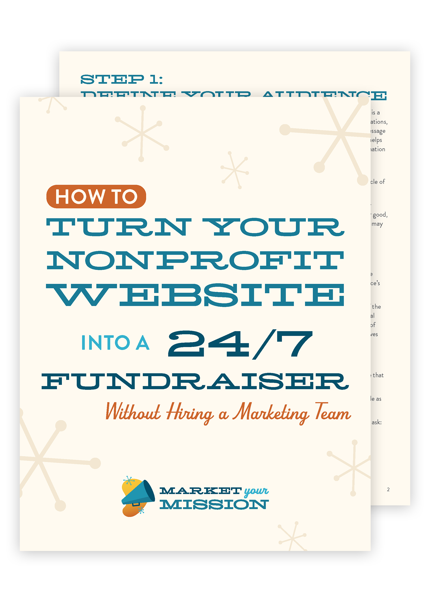
HOW TO TURN YOUR NONPROFIT WEBSITE INTO A 24/7 FUNDRAISER WITHOUT HIRING A MARKETING TEAM
Ready for your website to work for you, attracting donors, volunteers, and clients around-the-clock? Use this free guide to start building an effective nonprofit website.
Frequently Asked Questions
1. How fast should a nonprofit website load before visitors start leaving?
Aim for 3 to 5 seconds or less. Visitors are conditioned to expect information instantly, and if your site takes longer than that to load — whether they're a returning donor or someone who just found you through social media or a marketing campaign — they're likely to give up and move on. This is especially true for mobile visitors, like someone Googling your organization at a farmer's market table or community event.
2. What's the easiest way to check my nonprofit website's loading speed?
Google Webmaster Tools has a page speed evaluation feature that shows how quickly your site loads across different browsers. It takes a little setup, but there are plenty of free tutorials online to walk you through it. Checking your speed regularly helps you catch problems before they cost you donations.
3. What image size should I use to keep my nonprofit website fast?
Upload images no larger than 1,400 pixels on the long edge, which typically keeps the file size to about 1–2 megabytes. For smaller design elements — sidebars, call-outs, accents — use even smaller images. Also avoid autoplay video backgrounds. They look impressive, but they eat bandwidth, slow load times, and create accessibility problems, especially for mobile users or anyone on a limited connection.
4. Why should my nonprofit's about page and program pages include a call to donate?
Every page on your site is an opportunity to remind visitors why you need their support. It's easy for program pages in particular to focus only on the people you serve or the outcomes you've created, while forgetting that donors are reading those same pages to decide whether to support your mission. You don't need to turn every page into a full sales pitch — just include a simple, consistent reminder that you're a nonprofit relying on donations and volunteer time.
5. What should a nonprofit call to action actually say?
A strong call to action follows three simple steps: what you want them to do, what happens next, and — most importantly — what benefit they get as a result. For example, a volunteer sign-up might read: (1) Complete this form with your name and email, (2) A staff member will reach out to schedule your help, (3) Enjoy creating cleaner waterways for our community. That final step, the tangible benefit to the donor or volunteer, is the piece nonprofits most often leave out.
6. What's the difference between a primary and secondary button on a nonprofit website?
Your primary button should be reserved for the single most important action you want a visitor to take on that page — donate, volunteer, or sign up — and it should use high-contrast colors so it stands out. A secondary (or "hollow") button uses an outline style with no fill color, which carries less visual weight. Use secondary buttons for less critical actions, like downloading a report or visiting another page, so they don't compete with your main call to action.
7. What colors work best for donate and volunteer buttons?
High-contrast combinations work best — for example, a bright yellow button with dark blue text, or a dark blue button with white text on a light background. The goal is for the button to visually stand out from the rest of the page, since most web pages are already competing with images, text, and other design elements for attention.
8. Should my donation form be on a separate page or platform?
No — keep your donation form directly on your donate page rather than linking off to a different website or hosting platform. Any time you send a visitor away from your site to complete an action, there's a real risk you'll lose them before they finish. Keeping the form in place removes an unnecessary point of friction.
9. What information should a nonprofit donation form actually collect?
Stick to the essentials: name, address, email, and credit card information. Website usability research consistently shows that the more fields someone has to fill out, the less likely they are to complete the form. This matters even more for first-time donors who don't yet have a deep connection to your mission — extra friction can be enough to send them away.
10. Why do people abandon nonprofit donation forms, and how can I prevent it?
Abandonment usually comes down to friction: forms that are too long, live on a different site, or ask for unnecessary information. Every extra step or question is a chance for someone to get frustrated and leave. The fix is to make the entire donation process as fast, simple, and self-contained as possible — a fast-loading page, a form on the same page as your ask, and only the fields you truly need.
Full Video Transcript
Introduction: The Five Fixes That Get More Donors to Give
These five fixes could be the difference between a visitor to your nonprofit website making a donation or not. Hi everyone, I'm Ricardo Ibarra with Market Your Mission, where I bring my 20 years of experience in the design and marketing industry to help you grow your volunteer base and make more money from donors online. Let's get into the five fixes that I think your website might be needing to help you attract and convert more donors online.
Fix #1: Make It Fast — Why Website Speed Matters for Donations
All right. Number one is make it fast. Make it fast. This has to be number one because when someone visits your website, whether they're a returning visitor or they're a brand new visitor because of your social media or your outreach or your marketing campaigns, the first thing they want to see is your website. And if it takes too long, if it takes more than 3 to 5 seconds to load your website, chances are they're going to say, forget it, and they're going to move on.
That's because we are all so conditioned to fast website loading speeds. We want the information we want and we want it right now. So making sure that your website is super fast and loads quickly is vitally important to make sure that donors want to give to your nonprofit. One of the ways you can evaluate your website speed is through Google Webmaster Tools.
How to Check Your Nonprofit Website's Page Speed
Now, that requires a little bit of quick setup, but there's plenty of tutorials online. I recommend using Google Webmaster Tools, and there is a page speed evaluation tab where you can see how well your website is performing and how quickly it's loading across different browsers. Now, this is so important because we're often browsing the web on mobile. Imagine you're tabling at a farmer's market, or you're hosting a community event, and there's lots of new people around and they're googling your organization, or they're typing your URL into their mobile device.
Well, if it takes them a while to load your website, they might decide to move on or go back to Instagram or do something else. And you've lost a potential donor. So number one is to make it fast. One way you can do this is to use web optimized images. So instead of just uploading an image to the web and just figuring it out, or thinking that that'll be good, aim to upload an image that is less than 1400 pixels on the long edge.
Image Sizing and the Problem with Autoplay Video
Typically, that's about a one to a two megabyte image. That's a large image when possible, or when you're using a small image for maybe a sidebar or a call out or a design accent, try and use a smaller image so that your website will load more quickly. And a personal pet peeve of mine is the auto playing video background.
Oh my goodness, this is so inconsiderate to mobile users or users who are on broadband internet. Maybe in more rural areas. So do not autoplay a video under any circumstance. I know it looks really cool. It's not only great for it's it's not great for accessibility concerns, but it also starts using bandwidth and will slow your page loads time.
So if you want to have a video on your web page, absolutely embed it. But don't set it to autoplay so then the user can load the page quickly and choose whether they want to watch the video or not.
Fix #2: Show Them Why — Making Every Page Ask for Support
Okay, the number two fix on how to get more donors to give on your website is to show them why. Show them why they should give to you. And what I mean by this is every page on your website should explain to donors why they should donate to your nonprofit. Yes, even your about page, even your contact page, and especially your program page. I see so many nonprofits who have fairly well developed program pages, but they're only speaking to the people that they want to serve with those programs, or they're only talking about the results the program has created in the community, say, a waterway cleanup or some other kind of common good activity.
Well, your donors are reading those program pages to learn more about what you do and whether they want to support your mission. Now, I'm not saying you have to turn every program page into a full sales page, inspiring people to donate with lots of stories and examples and metrics and lots of direct calls to action. But I am saying that on every page of your website should have a reminder to the people reading that web page that, hey, we're a nonprofit and we need your donations.
We also need your volunteer time. So that was number two.
Fix #3: Tell Them How — Writing Calls to Action That Convert
Number three is tell them how this goes hand in hand with number two. Show them why. Tell them how is you. Explain to the website visitor reading that page exactly what you want them to do. This is called a call to action. And usually you're asking for money, or you're asking a potential volunteer to sign up, or you're asking people to register for an event.
This is so important and so simple, but yet it's often missed in nonprofits because they're so busy talking about their program and the good work they're doing. They forget that there's a human reading on the other side of the screen, and they forget to tell them, in clear and simple terms, exactly how they can support your mission. So, for example, the volunteer signup form above that it should say something like signing up as a volunteer for our next waterway cleanup party is simple one. Complete this form on this page. Send us your name and email address to one of our staff will reach out to schedule your help on our next cleanup. And three. Here's the kicker the last step should always be something that benefits the person you're speaking to. So number three would be enjoy creating cleaner waterways for our community. So number one is sign up on this form. Number two one of our staff will reach out to schedule with you. And number three is enjoy the good feeling knowing that you've created clean waterways for our community.
The Three-Step Formula for Donation and Volunteer Calls to Action
So this simple process you can do this for donations. You can do this for people signing up for your programs. And of course using the example I just gave you, you can use this to inspire people to volunteer. And now that that critical piece that I highlighted, the last step in in telling them how the last step should be the final result. So let me give you another example on your donate page. It should say somewhere. Donating is really easy. Number one, choose how much you want to give. Number two, fill out our simple secure online donation form. Number three provide books to kids or. Number three, ensure that art students have the supplies they need. Or number three make our community more welcoming for everyone. The number three, or the final step in that simplified process should be the direct, tangible outcome of their donation. So in this case, they're giving you money. But the result of that is art supplies for kids or making sure that the local library has lots of books or that the community is safer.
Those are the outcomes. So that's part of tell them how is you need to clearly call them to action and explain exactly how to take that action.
Fix #4: Guide Their Eye — Using High-Contrast Buttons
Number four, on my fixes that'll get more donors to give on your nonprofit website is guide there I guide there I now this is choosing high contrast colors for your buttons and your call to action text. To make sure that your message stands out. I recommend using a high high contrast button for the most important action that you want the visitor to take on every single page. So for example, on my website, I often have bright yellow buttons with dark blue text on top of it, or I'll invert that. I'll use a dark blue button on a light background with white text that's high contrast.
You want to make sure that it's high contrast so that it stands out on the page. Because often our web pages there's images, there's text, there's design elements. You want that button to be super, super obvious. And what should that button do? It should help them volunteer, donate or sign up. You don't want to use buttons to have them download your annual report or visit another page on your website.
Primary vs. Secondary Buttons: When to Use Each
You want to save that high contrast primary button for the big action you want them to take, and that should be donate, volunteer, or sign up. Now you may be saying, Ricardo, what about other buttons on the page? I want them to do all sorts of things. Okay. That's great. That's when you use a secondary button. And some folks call this a hollow button, because what you'll do is you'll choose one high contrast color. In the case of my website, it's usually a dark blue, and I'll have a dark blue button outline. And then the text will also be dark blue. There's no color inside the button, and that's helpful for a secondary call to action because it takes up less visual weight. Imagine a heavy dark blue button with white text over it.
That's the primary button. Now imagine a hollow button. Just an outline button with the text inside of it. That's the secondary button. So you can use a primary button and a secondary button to kind of provide different visual prominence on your page, but make sure you're only using that primary button for the one big action you want the website visitor to take.
Save the other calls to action for secondary activities, things that aren't quite as important or critical for text links, and using that hollow button style.
Fix #5: Make It Easy — Simplifying the Donation Process
Okay, the final website fix to help make donors give more is make it easy. You want to make your donation process as easy and simple as possible, because the more friction, the more trouble, the more they have to think things through and figure things out. How to give you money. The fewer people are going to give you money. One of the easiest way to do this is to make sure that your donation form is on the same page where you ask them to donate. So if you should have a donate page on your website and on your donate page, it really needs to have the donate form right there on that page.
Why Your Donation Form Should Live on Your Donate Page
Some folks link to it on a different website or a different hosting platform right there. Any hello Kitty right there, anywhere, anytime you're sending a visitor off your website to another website, you might lose them. So one best practice is to keep the donation page right on the donate page. Excuse me. Keep the donation form right on the donate page.
What Information to Ask For (and What to Leave Out)
Okay. The other thing to do is only collect the important information you need to capture their donation. I've seen donate forms that have all sorts of bells and whistles and questions that they want people to answer. No, you need name, address, email, credit card info. Boom. That's it. Keep it as simple as possible, because we also know from website usability studies that the more form fields someone has to fill out, the less likely they are to make it to the end of the form.
And if we're talking about new donors, first time donors, people you've inspired with your content and your website on the internet who don't have a deep connection to your mission, point of friction might send them away. They might go, oh, I'm too frustrated. I'm just going to go do something else. So you want to make sure that your website donation process is as easy and frictionless and simple as possible.
Recap: The Five Website Fixes That Get More Donors to Give
All right. Thanks so much for tuning in to the five website fixes that get more donors to give. Let's recap five website fixes to give to help donors give more. Number one, make it fast. You want your website to load quickly and simply for your website visitors, especially on mobile. So avoid using large images and don't autoplay any videos.
Number two show them why. Make sure that you are clearly communicating to the desires and values of your ideal donors, and every page on your website should ask the donor to give yes, even your program pages. Make sure that you have a small section on every page that reminds folks, hey, it's really important for you to make a donation to support programs like this.
Number three is tell them how I shared with you how to communicate online in such a way that makes it really, really easy for folks to donate. And we talked about the importance of call to action language that will clearly explain how to give to your mission. Number four guide their I. We talked about choosing contact, high contrast colors, and using a primary button and a secondary button to make sure that your donors and website visitors know exactly how to give to your mission.
And number five, make it easy. Be sure to simplify your donation process so that you don't lose any visitors. You don't make them frustrated with your process, so you can make sure to capture all the inspired donations that they want to make.
Get the Free Guide: Turn Your Website Into a 24/7 Fundraiser
If you want to learn more about how to improve your website. Be sure to check out the link below for my free guide, How to Turn Your Nonprofit Website Into a 24/7 Fundraiser Without Hiring a Marketing Team, it'll walk you through the exact five step process that I use every time I build a website for a nonprofit, so click the link below to download that for free, and I'll see you in the next video.